Read your dashboard
What each card on your Dashboard shows, including the Sending health badge.
Your Dashboard is the big picture of your sending: how your latest campaign did, how your audience is growing, and whether your sending looks healthy. Pick 7 days, 30 days or 90 days at the top. The charts follow your choice; the Sending health badge always looks at the last 30 days.
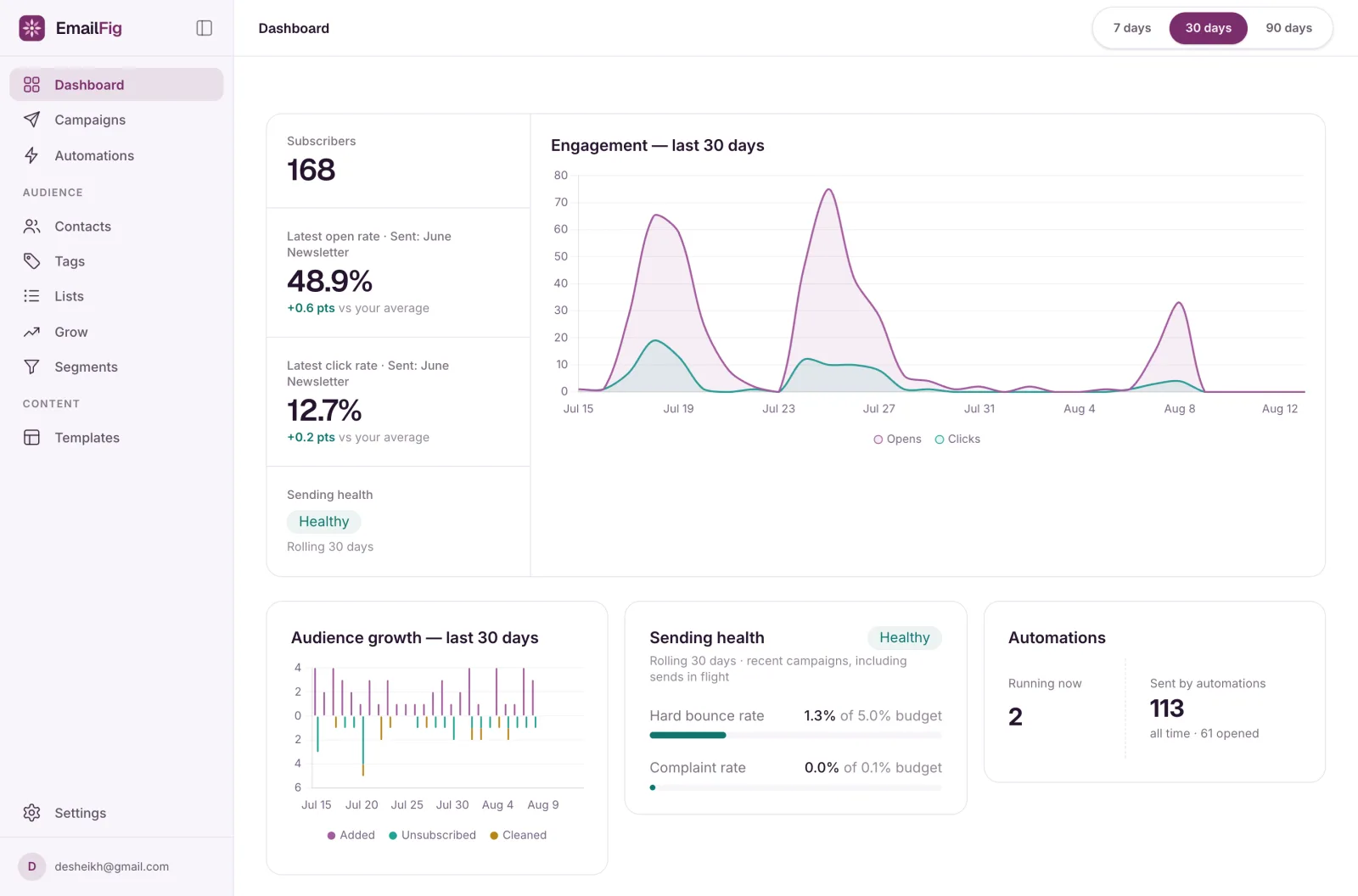
The top card
- Subscribers: how many contacts are subscribed right now.
- Latest open rate and Latest click rate: from your most recently sent campaign (named beside the label), with how far it is above or below your average for the period once there’s more than one campaign to compare. Before your first send, these read Avg open rate and Avg click rate.
- Sending health: the badge explained below.
- Engagement: opens and clicks per day over the period you picked.
Audience growth
Contacts added each day above the line, and contacts who unsubscribed or were cleaned below it. At 90 days each bar is a week.
Sending health
This card shows your Hard bounce rate and Complaint rate (people marking your email as spam) over the last 30 days, each measured against its budget (the level it’s judged by), and one of four badges:
- No recent sends: nothing has been sent in the last 30 days, so there is nothing to measure.
- Healthy: both rates are under budget.
- Needs attention: your hard bounce rate has reached 5%, or your complaint rate has reached 0.1%.
- Sending paused: your account is suspended, so nothing is sending. See My account was suspended.
It counts every email you’ve sent in that time, including automation emails and campaigns still sending. Needs attention doesn’t stop your sending by itself, but it’s worth acting on before it gets worse. The tick on each bar marks the budget, and a rate over it gets a line of advice with a What to do link.
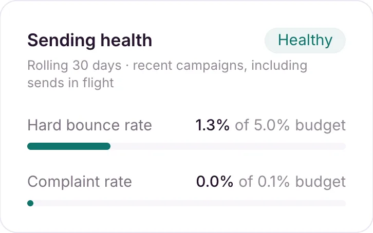
This card counts hard bounces only, while a campaign report’s bounce rate counts hard and soft bounces, so the two numbers differ. See Metrics defined.
Automations
Shown once you have an automation running or one has sent. Running now is how many are live; Sent by automations is a total for all time, not only the period you picked. See Read an automation report.
Recent campaigns
Your last 10 sent campaigns with recipients, delivery rate, opens, clicks and unsubscribes. Click a name for its full report, or View all → for every campaign.
If you collect unsubscribe reasons, a line underneath shows how many you received in the period. Click it for the breakdown. See Why do people unsubscribe?.
If something’s wrong
- “Needs attention.” High bounces or complaints almost always come down to list quality. Start with Clean your list of inactive contacts and Why are my emails going to spam?.
- “Some of your analytics are out of date.” The charts may be missing recent activity while EmailFig catches up on its own. Your campaign reports aren’t affected. If the warning doesn’t clear, email contact@emailfig.com and a real person will help.
- A rate shows ”—”. There’s nothing to measure yet in that period, such as no emails sent.